Disha had built an audience through social content, but every visitor landed on a generic bio-link page with no clear next step. There was no way to turn attention into a paying client without a back-and-forth in the DMs.
The brief: one page that establishes credibility fast and gets a visitor into a free trial before they lose interest.
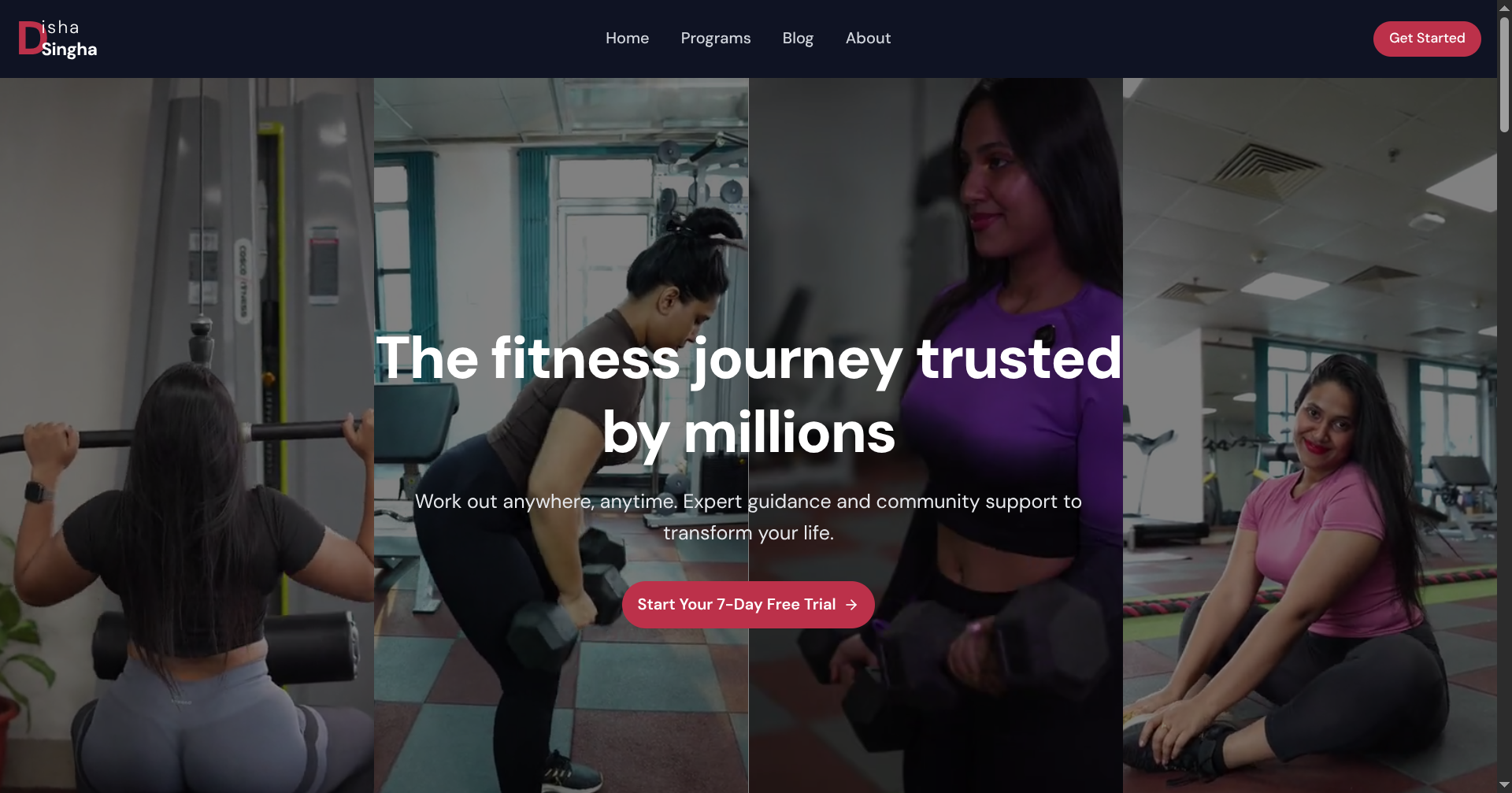
Fitness buyers trust faces over features. The page opens full-bleed with real client photography split across the fold, with the offer and CTA layered directly on top — no scrolling required to understand what's on offer.
Everything below the fold reinforces the same promise in a different form: programs, community, and expert guidance, each with its own single clear action.
Built on Next.js with a lightweight content structure so Disha's team can swap in new client photos and programs without touching code. Dark navigation bar with a single accent color keeps focus on the imagery and the CTA.
Launched in three weeks, end to end — brand direction, copy, and build.
People used to message me asking how to sign up. Now they just click.
A single-page site structured around one goal: getting a visitor into the 7-day free trial.
A dark, confident visual system built around Disha's own photography and voice.
An editable layout so the team can update programs and blog content without a developer.